
Flowers from a Magic Seed: Recognizing Ottoman Iznik Ceramics
Tulips, carnations, hyacinths, roses, even peacocks bloom on these plates. Plus, a mini-introduction to the aesthetic concept of stylization.

Today’s focus is on one very small but specific, lovely, and whimsical characteristic of Ottoman Iznik ceramics that will provide an introduction to an enormous aesthetic concept: stylization.
Can you guess from these examples what that characteristic might be?


Iznik, in today’s Turkey, was never a large town, but in the 16th century it became well-known for producing distinctive ceramic dishes and tiles with high quality and gorgeously florid decoration. This was one aspect of a real flowering of arts in many media such as textiles, calligraphy, and architecture under the Ottoman Empire, one of the world’s great political powers in the Renaissance. To give you a brief, very general sketch of Ottoman reach and history: during a time when Europe was a hodgepodge of often disorganized city-states grappling with religious strife, the Ottomans especially under Sultan Suleyman the Magnificent consolidated power and conquered a geography stretching across the Mediterranean, the Near East, Northern Africa, Greece, Hungary, and into Europe, reaching all the way to the gates of Vienna in 1529 (the first time). Although Islam was the official religion of the Ottomans, other religious groups were treated with relative acceptance; for example, several Jewish groups exiled from Spain relocated to Ottoman territories. Still, their army could be brutal during expansion, including taking slaves from conquered areas. Artists and traders from Europe sometimes traveled to Istanbul, discovering that above-mentioned flowering of arts and architecture, such as the major mosques and complexes by the truly great architect Mimar Sinan (c. 1488/90-1588). They brought back drawings, textiles, ceramics, tulip bulbs, and fascinating stories—sometimes exaggeratedly orientalist, sometimes more cooly observational.
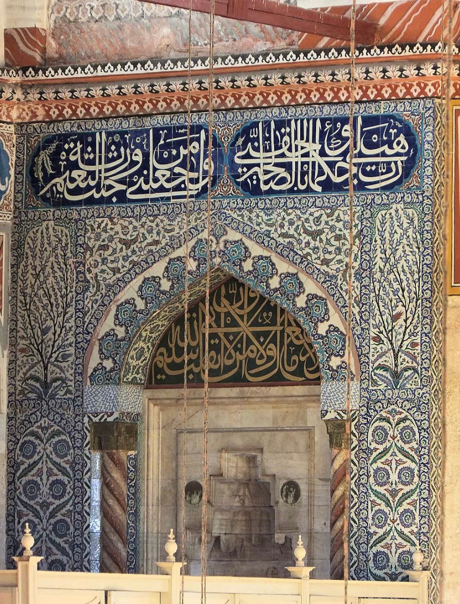
Sinan chose to use the florid tiles produced by Iznik artisans to decorate many interiors of the breathtakingly beautiful and magnificent mosque complexes he designed. I took a whole seminar on Sinan long, long ago with the wonderful scholar Gülru Necipoglu; someday I’d love to see these mosques in person, in part to see how the tiles from Iznik were integrated into the architecture and remain as bright and crisp as when they were placed 500 years ago.
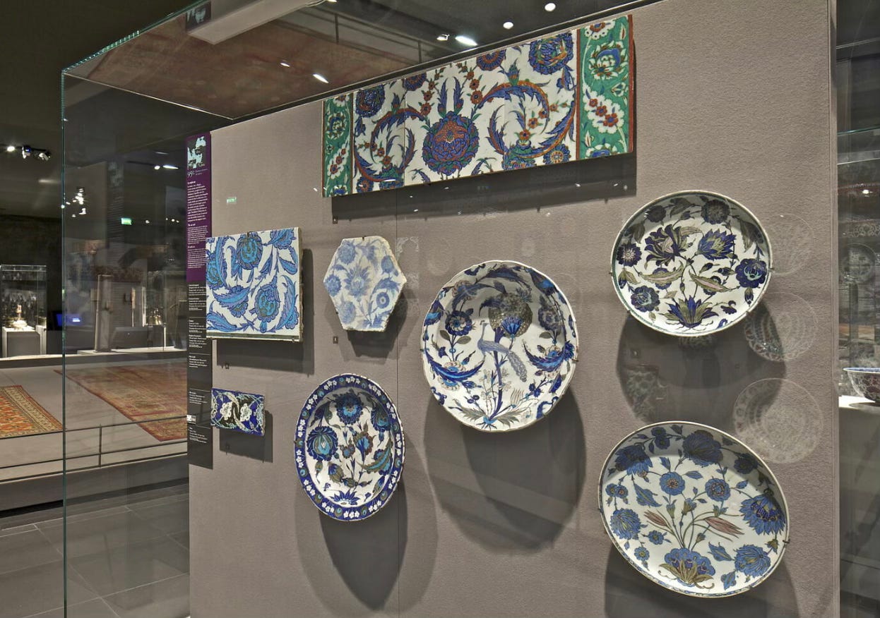
I have seen many examples of Iznik ceramic tiles, dishes, and fragments that have made their way into museums, and I especially enjoy identifying Iznik ceramic dishes, plates, and shallow bowls. I use the words florid and flowering deliberately, above: Ottoman artists loved flowers. Plus, they could stylize carnations, roses, hyacinths, and especially tulips, without impunity from the strictures of Islam. Islamic traditions discourage representational art, especially the representation of the Prophet Muhammad and human figures in general (depending on the local traditions, but we won’t get too deep into that today).
Anyway, Ottoman artists combined many types of stylized flowers on a single round plate, and—and this is the identifier that I find so endearing—all the flowers spring from the same point on the rim of the plate. (Did you guess this from the pictures I included above?) It’s as though they come from a magic seed, from which could sprout and bloom several types of gorgeous flowers at once! The Iznik artisan was the gardener, coaxing them into blossom. From this single tuft of leaves at the edge, long stems swirl and push upward and around the plate or dish, often spiraling back around themselves to end in overly large blooms. The flowers jostle each into their own silhouetted space, facing frontally or in profile, in order to best showcase their abundant blooming beauty.
Other traditions space their designs, floral or otherwise, around the circular shape, so that you can place a plate on the table facing whatever direction. For Iznik dishes, this single origin point for the stems means that these dishes have a directionality, a mini-gravitational pull—you can’t display them just any which way, n’importe quoi. These flowers come from a “ground” out of which the plants grow. The design, though stylized, has its roots (as it were, though no roots are shown, usually:) in observation of nature, of actual flowers rising from a point in the ground.
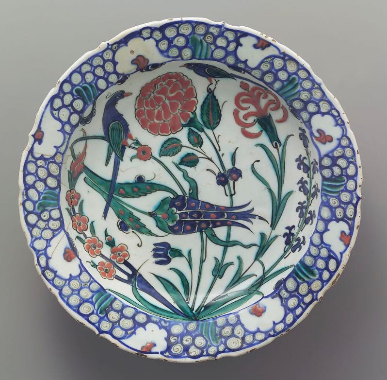
A nice example (above) is a dish in the Met, sporting a spotted blue tulip, reddish carnations in two styles, dark blue stretched-out hyacinth blooms, and a set of daisies on a three-tined fork. Two birds perch on the stems, their long tails rhyming with the long stems of the flowers, turning towards each other as if in conversation. As the flowers push upward, they curl around and duck their heads as though bending under a doorway. (Yes, flowers have heads—we “deadhead” them when they are spent to encourage further blooming in our own gardens.) The artisans respected the format of the dish, as though it’s a no-cross-zone, with the edge of the dish magnetically repelling the stems. I love the way the artisans fill up the space without crowding it; each flower or stalk has its own space, with minimal overlapping. Only the slender stems are allowed to cross each other. As they spiral around, each flower or bird gets its full silhouette. With this example, the stylized tulip competes good-naturally for attention with the abundant carnation above; the carnation is in full bloom with a tight globe of petals and multiple buds on its stem. The two major flowers do si do around each other, like square-dance partners.
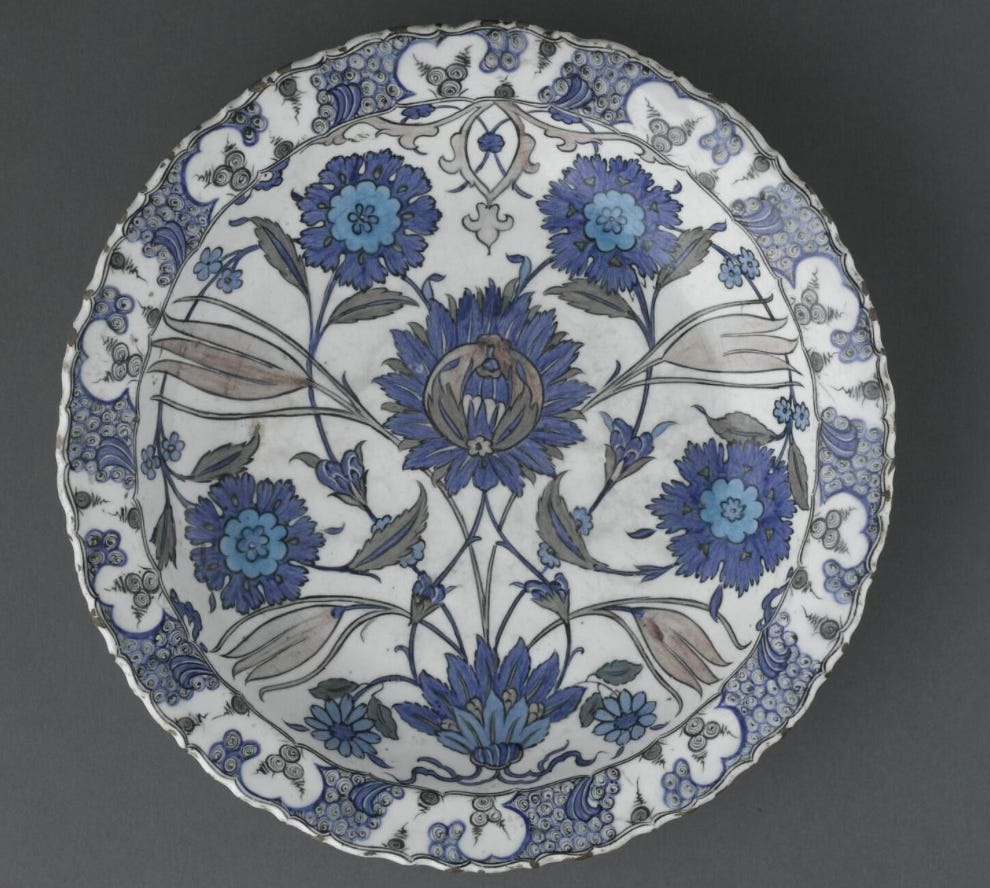
In this similar example at the Victoria and Albert Museum, carnations and tulips spring from a ribbon-like bow of an origin-tuft. Again, flowers bend and swirl around the dish. Both of these examples have a rim decorated with clusters of curls in blue and black over a white ground; clearly the artisans admired the blue and white decorations of contemporary Ming dynasty porcelain from China, famous still today for blue and white designs. But the Ottoman designers developed their own vocabulary that was completely distinctive, especially with the particular stylization of their favorite flowers.
OK—what do we mean when we say something is “stylized”? We mean it is a representation with the essential characteristics of something, recognizable because of a convention that we all agree represents that something. Take the tulips, for example. We can recognize which flowers on the plate are the tulips because they share some characteristics observable in natural tulip flowers, such as the long, wide leaves, the tapering, elongated petals, and their closed U shape. It’s the essence of the tulip form, without extraneous detail. To stylize a tulip: make it a generally symmetrical silhouette, with an outlined shape, in two dimensions with no shading, no distinct individual variation, no biological imperfections. None of these tulips are a portrait of any particular flower—it’s a simplified version of the most tulipy tulipness. An actual tulip wouldn’t grow from a strand of a stem too slender to support its weight, or sprout from the same source as carnations or even other tulips, but we can still recognize the tulip on the dish as a tulip. Sometimes, as in the Met example, they’re given some extra patterning like the polka-dots. The artist crafts the tulip form while considering the format and medium of the painted ceramic dish, and no one is distracted by the bit of added polka-dotted flair.
Flowers printed on wallpaper (generally) or embroidered on a dress are also stylized, since these formats—infinitely repeatable, or two dimensional on a blank ground—are not flowers in a perspectival space, as in so many paintings (that have typical Albertian windows, starting generally in the Renaissance*). As with “abstraction” and “naturalism,” the term stylization exists on a long continuum—the more highly stylized something is, the further it is from the form as observed in nature. As you go about looking at artwork—or patterns on fabric, or ceramic, or graphic design—see if you can determine where you might place that imagery on the stylization continuum.
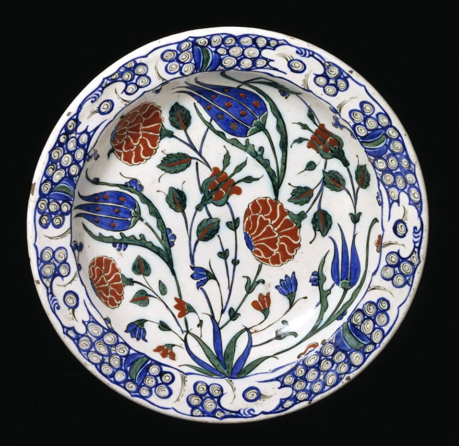
Let’s take another example, which the Louvre calls a plate with a composite bouquet. It’s not really a bouquet, because the flowers sprout from that edge-ground tuft (here like a flower in profile and with root-like tendrils below), but the idea behind the label is telling. Like a bouquet of flowers, which is usually a variety of blooms combined for our delight, the Iznik plates show off many types of flowers at the same time. Here, the tulips are in profile and the sprouting carnations face frontally. This one is more symmetrical and toys with the possibility of overlapping at the rim. The long-lasting flowers preserved on the plate mean that the Iznik artisan could combine flowers, whatever their blooming season. Tulips bloom long before carnations, for example, but they can all be included on one plate.
In this, the Iznik flower collections on plates and tiles foreshadow the Dutch floral still life paintings of the 17th century, which skillfully combined many types of flowers that could not possibly be in bloom at the same time. Remember this idea when I discuss, for example, the painting of the wonderful Rachel Ruysch (1664-1750), coming in a future post here at The Vivid Eye!
Now you’ll always be able to recognize Ottoman Iznik dishes! Look for the single source from which all the flowers sprout. You can also begin to see overlaps in style, color, and flow on Iznik tile panels made for an architectural context.


Finally, TWO BONUS IMAGES today!
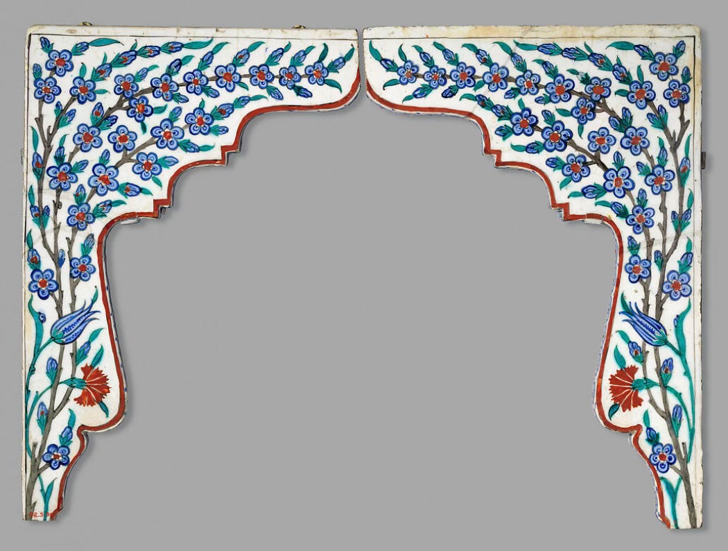
During my collection of images for this post, I came across this Iznik tile panel on the Met’s website, clearly made for an architectural moment, perhaps arching over a window. You can see how, as in the dishes above, the way three kinds of flowers sprout from a source and fill the space below.
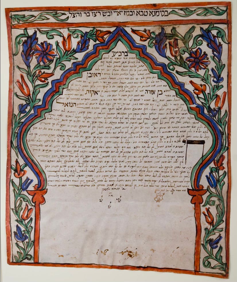
And THEN, I visited an exhibition at the Magnes Collection of Jewish Life and Art here in Berkeley, entitled In Plain Sight: Jewish Arts and Lives in the Moslem World. (Closing soon, in case you are local!) This ketubah (marriage contract) on parchment takes its decorative frame also from an architectural context, that had been part of the Ottoman world long before. It is from Morocco, dated 1875, but I was tickled to find it this week. The similarities bear out the theme of the exhibition, which displays objects from a Jewish context with affinities and design similarities from their origins in Moslem countries.
*I alluded to Leon Battista Alberti, who wrote about paintings as “windows onto the world,” already in my post on Veronese. I’m sure he’ll continue to come up!
RESOURCES:
Top gallery of images, top row:
Plate with large composite flower, Iznik, c. 1560, Musee des Beaux Arts, Lyon
Plate with Central Bouquet, Iznik, c. 1580, Musee des Beaux Arts, Lyon
Iznik Dish, Four Tulips, Late 16th century, Metropolitan Museum of Art
Bottom row:
Iznik Plate with lower chip, c. 1600, Victoria and Albert Museum
Iznik Plate with Peacock, 1540-1555, Louvre Museum
Plate with Composite Bouquet, Iznik Dish, Louvre Museum
These are beautiful! Thank you so much for the analysis here too. I learned a lot!!
This was such an amazing read! I was just in Istanbul a week or so ago and now I am in Amsterdam. I will be looking for the Islamic floral influences in the Dutch art on display at the Rijksmuseum!
One interesting note I learned while touring a ceramics workshop is that traditionally they use a quartz glaze (rather than the glass glaze we use today) for longer lasting color and preservation.