


Open the lid to reveal...
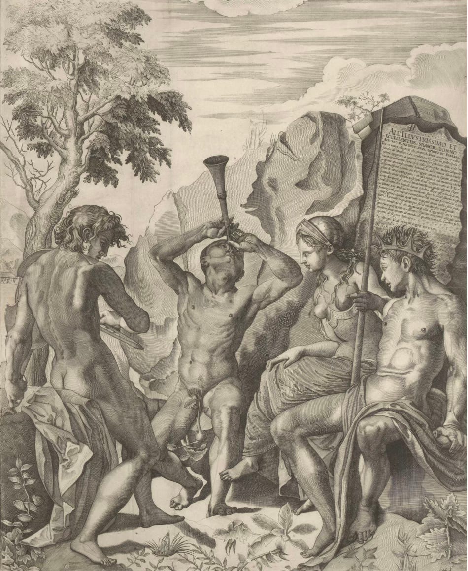
...the painted instrument behind Giulio Sanuto's Apollo and Marsyas.

Previously on The Vivid Eye (on December 6, 2024) you heard the story of Apollo and Marsyas’s musical competition that ended in the gruesome punishment of Apollo flaying Marsyas alive. (Thank you to those of you who caught my error—fixed immediately— that had this the opposite way ‘round as soon as I hit “publish.” Please ask if you have questions about the artwork OR my logic!)
You also could have literally heard the shawm and the lira da braccio, two Renaissance instruments that “updated” the myth to the 16th century—and then I left you with a teaser that there was another instrument “hidden” in this artwork. If this hint caused you to look even more closely, I imagine that you may have found other wonderful details….


To find the instrument to which I am referring, we have to zoom out for more context. Giulio Sanuto, in this Apollo and Marsyas, takes the story and composition from another artwork, a painting by Bronzino, now in the Hermitage collection in St Petersburg.
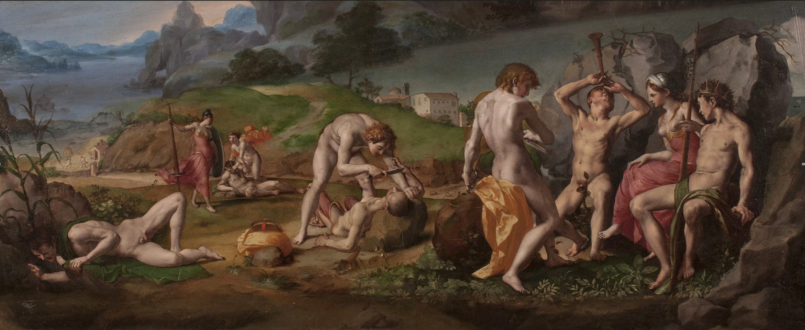
Bronzino was one of the most ambitious painters of his generation in the mid 16th century, painting portraits of the Medici family and for their chapels in Florence. He absolutely would have known the cartoons after the Battle of Cascina and the Battle of Anghiari. But this painting by Bronzino did not originally stand alone—instead, it was the cover of a musical instrument! As you know, musical instruments are very often decorated with painting and/or carving. The Apollo and Marsyas myth would have made an appropriate subject for the decoration of a musical instrument, given its musical theme.
The original shape of the painting would have fit the irregular shape of the instrument, that might have been closer to a clavichord than to a harpsichord, given its size—but Renaissance instruments were not issued in standard shapes. A clavichord, like the harpsichord, has a keyboard with plucked strings that do not have the ability to play louder and softer, like the pianoforte of later centuries, and today. (I will link to a video of a 16th century clavichord performance at the end of this post so you can hear what it generally sounds like.) At some point during its history, probably in the mid nineteenth century, the painting was trimmed to mimic a rectangular shaped painting, to be hung on a gallery wall. It has recently been restored, and you can find out more about the restoration here.

Seeing it on the wall in a museum is a completely different experience of the artwork than when it was the cover of an instrument. The original experience of this artwork would have included a moment when the lid of the clavichord would be lifted up to reveal the strings and the keyboard—and the painting! This element of surprise, and hopefully delight, could mingle with the songs played on the clavichord, a way to appeal to multiple senses for the player and their intimate audience.
Wouldn’t it be fascinating to know who commissioned Bronzino to paint this instrument, and whether it was made for a particular musician? The small, domestic clavichord—some later examples have small drawers to contain notions for sewing—could easily have been the property of a young aristocratic woman, since quiet music-making was one of those decorous activities available to a 16th century young lady. But when you consider the subject matter of this particular clavichord painting, my idea seems rather scandalous, given the emphasis on the male nude in the picture. Bronzino didn’t even bother to fig-leaf the barber’s nakedness, and barely covers Marsyas’ with what appears to be a growing radish or bulb-y plant. Maybe the highbrow source of the Greek myth (or Ovid’s interpretation of it), with its musical theme among royalty and gods, made it just barely appropriate enough of a choice for a young woman, to get away with the depiction of super fit male nudes shown in a variety of poses hidden under the lid of her clavichord. It reminds me of the female nudes painted on the inside of the lids of cassoni, or wedding chests, from earlier in the Renaissance. I’ll have to tell you more about those in a later post!
Whatever the musician’s gender, by placing their fingers on the keys, they could imagine being participants in a divine pursuit—music so valued by the gods that they would flay alive those with too much ambition. My question for you, is, would this motivate you to practice more, or only just enough…?
The theme of artistic ambition and competition animates Giulio Sanuto’s print after Bronzino’s clavichord cover, arguably even more than the original painting. For one thing, the print medium makes the quotes from the Battle of Anghiari and the Battle of Cascina more obvious, since the cartoons and drawings for the Battles were copied and circulated in print form. Sanuto, working in the printmaking center of Venice, definitely would have known many of those prints, and would have had them available during the process of translating the painting into print form. Prints made after paintings are called “reproductive prints,” but the process is not a simple, reductive one. A printmaker had to make decisions about shading, tone, scale, and size, as well as reversing the image (sometimes they didn’t bother with that step, and the print reverses the composition of the painting—we saw this on December 6, too, in the Battle of Anghiari examples I gave: one of the expressions is reversed). In this case, the size itself is ambitious enough, and seems to be a direct competition with the original painting—Sanuto even made the print to be basically the same size as the painting!*

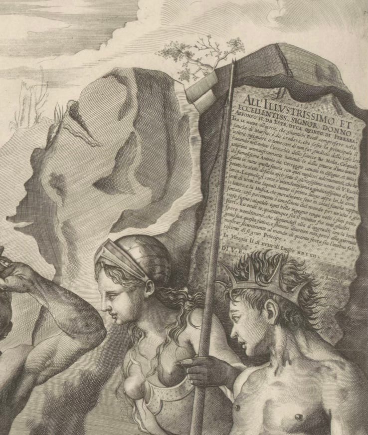
Giulio Sanuto also inserted details that are not in Bronzino’s painting. He added the extremely recognizable Piazza San Marco in Venice, with the Ducal Palace, the Basilica of San Marco, the tower or Campanile and the two columns, topped by the winged lion of Saint Mark on one and St Theodore on the other. He also added the quotation of Raphael‘s Parnassus fresco, which was in Rome but he could have seen it reproduced in print form as well. The quotations from Leonardo, Michelangelo (through the Bronzino) and Raphael show that Sanuto can reference the glories of Florentine, Roman, and Venetian art. I’m less sure about the other city he added in the background—does anyone recognize it?


Could it possibly be a town where Alfonso II d’Este lived?
Because Sanuto has dedicated this print to “the most illustrious and excellent Alfonso II d’Este, Duke of Ferrara.” (Although, the city doesn’t look particularly like Ferrara to me.) In an inscription on the banner of Minerva’s staff, he spells out some of his ambition, the things he added like the Muses and Venice, and how he adapted the painting (—by Correggio. Wait a second, you say—I thought it was by Bronzino?! Well, either Sanuto didn’t know the original artist or he was name-dropping a more local, yet also quite famous artist that Duke Alfonso might have known. Let’s set aside attribution questions for now, since I haven’t been to the Hermitage myself; but it is fully accepted as Bronzino’s work today—the recent restoration with its jewel tones does seem closer to Bronzino’s work than Correggio’s.) I might talk about such dedicatory inscriptions in a later post, but for now let me say that it was quite common for a print maker to hope for the patronage of a powerful ruler by dedicating a print to them.
Sanuto was showing off in hopes that the Duke might give him regular employment, the way that Bach (much later, in 1721, when larger harpsichords were having their illustrious moment) sent six concertos demonstrating his skills to the Margrave of Brandenburg, in hopes for a position there.
I have seen this very large engraving in person (in an impression in the National Gallery in Edinburg) and it is indeed a showpiece; it is among the few works that Giulio Sanuto was proud enough of to include his name. But was he successful in adapting the composition over three large sheets of paper? If you did your homework, you saw that Sanuto chose not to carry significant representation over the break. Bronzino’s painting has an even, satisfying progression across the work: for example, Apollo (right to left) is shown big, medium, small, as though embodying the perspectival lines of the unified painting. But Sanuto nudged the group with Apollo and Marsyas over so they fit framed on that paper; he scootched over Apollo flaying Marsyas so they fit in the middle sheet; and he had Midas’ barber alone on the left sheet. We notice moments of shortcuts, like on the hills and grounds and fractured trees, and the inability to truly unify this composition over the joints between the sheets. Between the center, and left sheet, he doesn’t even attempt to have significant representation carry over the break, it’s just the sky, the hill with their patches of grasses that look like tiny, bush fires, the ground right up next to, but not continuing over the rock on which Apollo’s instrument lies, and then below a complete break except in line by the vegetation on the bottom of each print, which is a abrupt transition showing that he did not know how to carry over the break.
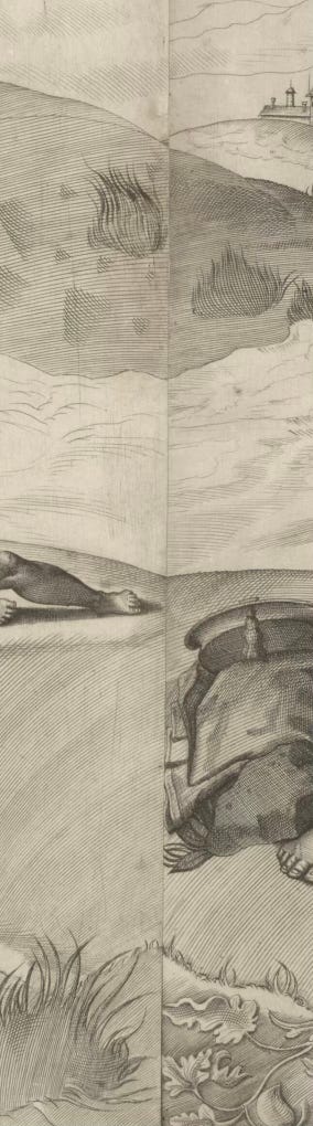
Why? Was he just not a super confident printmaker? This seems improbable since he was also a printmaker of maps. Rather, I think it was just not his emphasis here. He certainly puts more effort into the human (male) figure than the ground, trees, and plants. Sanuto has a great command of the use of crosshatching, to add more shadow and depth to muscular flesh.


Another possibility is that he wanted the sheets to be able to be sold separately— dividing the composition meant that buyers of the print could own and display the sheets individually. The right sheet in particular works as a composition of itself.
We know this happened sometimes— a customer who could only afford part of the work could buy just one paper. This is reflected sometimes in museum collections—only one stand-alone scene is in the collection (or alternately, all the papers except the one that stands best alone survives in a collection).
To end: here is Darcy Kuronen playing an Italian clavichord from the late 16th or early 17th Century, now in the Museum of Fine Arts, Boston. Note the painting on the lid! He is playing “Four Variations on ‘Watch My Cows’” by Luis de Narvaez, of 1538, quite contemporary with Bronzino’s painting.** Enjoy! I’d watch your cows, Luis, since you ask so trippingly!
*Bronzino’s painting was 48x 119 cm; the impression of the print, from the Rijksmuseum website: 51.5 x 125cm long. So they are roughly the same size! The print has a border, sp they are probably counting that. The National Gallery of Scotland’s impression is 51.5 (average) x 127cm.
**Bronzino’s painting was probably made for someone in the household of the Duke of Pesaro, Italy, where Bronzino and several other artists were painting frescoes for the Villa Imperiale in 1530-31. So the instrument would have been part of an ambitious decorative scheme. I wonder how (or whether) the Apollo and Marsyas theme fit into the frescoes on the wall!