


Rauschenberg's "Love Letter" to America
and two contradictory ways that looking closely at art can make us better citizens in a turbulent political time

I am happy to oblige a request from one of my founding subscribers for more discussion on modern and contemporary art, as I aim to showcase a variety of styles and media here at The Vivid Eye. During my visit to Santa Barbara Museum of Art last August, I caught the exhibition Robert Rauschenberg Autobiography: Works from the Collection, which included this small silkscreen entitled For Ferraro.
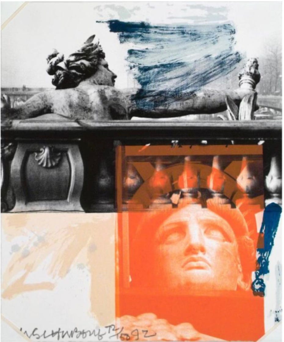
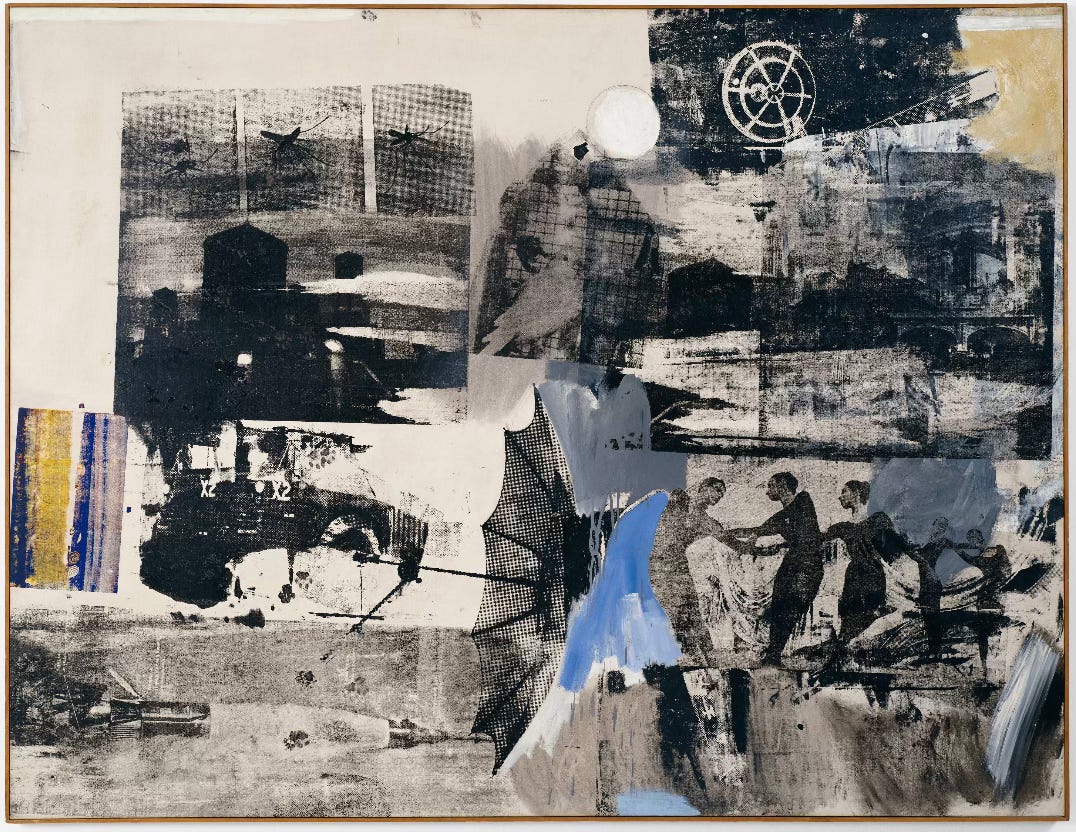
One of the most innovative and versatile artists of the 20th century, Robert Rauschenberg (1925-2008) redefined the boundaries of sculpture, painting, printmaking, collage, performance art, choreography, and more (I will sprinkle some of his characteristic works into the second half of my writing, below). He usually produced works on a scale that was quite large, often the sizes of bedsheets, whether in his Combines (sculptural collages of found objects), or silkscreens, or painting collages. Of all the works I had seen by Rauschenberg, I had never encountered one that was so small. For Ferraro is only about 10 x 8 1/2 inches, slightly smaller than a sheet of standard printer paper.
Intrigued, I moved in for a closer look. Because of the title, “For Ferraro,” the size, the taupe-pink and red colors, my first thought was that Rauschenberg made this to be a more intimate, personal gift, like a valentine. Rauschenberg‘s handwritten signature here, different on each of the 150 impressions of this silkscreened image, is also proportionally much larger on this small artwork than on his usual large works, as though he was signing a letter. But then I recognized the imagery—the famous stalwart face of the Statue of Liberty, printed in red from a photographed-from-below image, framed by a rectangle. Lady Liberty’s crown overlaps a photographic image in black and white of a balustrade and another Beaux Arts style sculpture on a bridge in Paris, the Pont Alexander III, built 1896-1900, not too long after the Statue of Liberty was dedicated in the harbor of New York City in 1886. The seashell decoration of the French bridge alludes to the water below, and in the distance, you can see the trees on the bank of the River Seine.
Liberty’s openwork crown overlaps the urn-shaped railings of the balustrade, its pattern rhyming with the repeating urn shapes. By juxtaposing these images of two allegorical female sculptures, Rauschenberg draws attention to their commonalities: they both wear crowns, the French one of laurel symbolizing virtue and skill, accomplishment and victory; Liberty’s crown may come from ancient Roman sculptures representing Libertas (the personification of liberty). They both extend an arm to bear a torch over bodies of water as though guiding travelers to safety, like a lighthouse. Although we only see the French Lady’s torch here, we certainly remember Lady Liberty’s. Maybe the exclamation point here takes its place, a synecdoche of her outstretched arm and torch. The confident, wide, quick brushstrokes in blue and the emphatic, painted exclamation point by Liberty’s head add the blue to the red and white, the shared colors in the American and French flags. I remind you that the Statue of Liberty was a gift from France to America, underscoring the shared values of liberté, egalité, fraternité (still found inscribed today over the doors of every French school). This suggests that Rauschenberg here made his own patriotic gift, using his artistic practice and idiosyncratic style in service to the ideals of America.
To return to the title: For Ferraro. I had to look up who that might be, and learned that Rauschenberg created this silkscreen to benefit Geraldine Ferraro’s campaign for a New York Senate seat in 1992 (a year in which I was too young to have been politically aware). Ferraro must have been a formidable politician, having been the first woman on a presidential campaign ticket as the running mate of Walter Mondale in 1984.
Rauschenberg had been politically active throughout his career, and corresponded with political figures at least from the 1960s. For Ferraro was not his first artwork created to support politicians. Rauschenberg sent a drawing entitled Election to John F. Kennedy after JFF’s 1960 presidential win, writing in the letter accompanying it: This drawing should belong to you or me. If you enjoy it I would be deeply honored if you accept it…a need to celebrate your victory in my own medium is the subject…The Greek head and Washington reiterates that the content of the drawing is art and politics. Red, white + blue is your color….*
As Rauschenberg wrote and as you can see, Election included recognizable images—George Washington, a bald eagle, the colors of the American flag, even a tiny star (top)—of relatively guessable, recognizable American symbolism. In For Ferraro of 1992, Rauschenberg, though one of the most innovative and avant-garde artists of the 20th century, continued to use very traditional symbolism for the ideas of America and liberty: the Statue of Liberty herself, the red, white, and blue. Rauschenberg does not illustrate a particular politician’s motto, platform, or party ideology; neither does he use the Statue of Liberty ironically or subversively. Instead, he commits fully to conservative, recognizable American symbols, and the values of Liberty held dear by all Americans. There’s a sense of Rauschenberg’s patriotism that comes out when noticing the layering of images of sculpted forms, with brushstrokes that emphasize without crossing out or obscuring. We can see all of Liberty’s face, and the fast, blue back-and-forth brushstrokes keep carefully between the torch and the face of Liberty’s French counterpart.

Rauchenberg’s was the patriotism of the engaged citizen, wherein he supported political candidates he believed in (of both parties, incidentally) and worked actively for improvements and worthy causes. In 1968, Rauschenberg created a poster for the reelection campaign of the Republican senator Jacob Javitz. He made another poster for the first annual Earth Day in 1970, to benefit the American Environment Foundation of Washington DC. Along with several American artists, he withdrew his artwork from the 1970 Venice Biennale, to protest the Vietnam war, and participated in an exhibition, entitled Art for Peace, to benefit anti-war candidates for Congress. He was active in politics especially in support for the arts, including tax benefits for artists’ donations to nonprofits, and he lobbied against budget cuts for the National Endowment for the Arts. In the 80’s and 90’s, he lobbied for environmental causes, such as for the Earth Summit, the United Nations conference on environment and development 1992.
WHY ART IN A POLITICALLY TURBULENT TIME?
A close look on an overtly political artwork gives me the timely chance to propose the answer to the question: why on earth can I continue to devote energy to thinking and writing about art during a time when the constitutional values and institutions of the US government are in crisis? What is the urgency of looking at art? when compared to the impact of the current administration causing turbulence in global markets and political alliances; when valued government services are being cut by the richest of men while the poorest and most needy among us suffer and die because of shortsightedness; when students and legal residents are rounded up and deported without due process; when safety nets are being dismantled; when harmless groups of minorities senselessly targeted.
Where then does writing about art stand in a time of dysfunction and crisis? How can I justify spending time guiding you, my dear readers, to look more carefully and more closely at artworks involving the long ago and far away, with no connection to current events? Is this not unlike a case of Nero fiddling while Rome burns?
TWO CONTRADICTORY ANSWERS
I have two equal yet opposite rejoinders to argue the case for continuing to read and write and look carefully and passionately at artwork during politically troubling, exasperating, and endangering times.
First: Looking at art can be a stepping away, a moment of needed rest, and an antidote to the stressors of current events. Long, sustained looking (at art, nature, music, loved ones) is healthy for our mental reset and a respite from the herky-jerky quality of a barrage of outrageous executive actions in the news. Look at art to be reminded that in the midst of cruelty, bullying, and destruction, humans are capable of loftier accomplishments, of masterpieces that showcase great human creativity. We have a culture that endures and is worth preserving; looking at and thinking about art allows for a stepping back and away to contemplate a bigger, more universal picture of the human condition.
Secondly, the opposite is true: close looking at art can prepare us to step closer to engage more thoughtfully with the onslaught of troubled politics, especially when it seems all over the place. A sustained look at a work of art can train our eyes and our minds to focus. In noticing more details with careful looking, the critical eye can train the critical mind. A careful look at a detail in a painting you had never noticed before might open the door to deeper thinking. You might begin to wonder if there is something you missed about an opinion you’ve held long dear. We all have biases that cause us not to question the things we have already accepted as truth.
Cultivate the needed skill of paying attention, noticing what is happening in public in order to ask what may be happening behind the closed doors. Recognize the brave, needed work of those journalists who check facts, gather footage, give thoughtful interviews. Recognize and start to ignore any newscasters that are not interested in calm perception, but in bluster, hasty interruption, and straw-man arguments, for the sake of ratings or distractions. Be grateful to the judges that demand more accurate information, in order to keep the executive and legislative branches accountable. You can vote more thoughtfully, listen more carefully (especially to those who voted differently), call your representatives, and join peaceful protests and march in the streets.
Thank you for joining me in those actions and reading me here, as I reset by writing about art history. Let me know if you have questions, about Rauschenberg, the silkscreen process, etc!
RESOURCES
The website of the Robert Rauschenberg foundation includes a wealth of information including a helpful timeline of the artist’s collaborations, exhibitions, associations, and political involvement. https://www.rauschenbergfoundation.org/artist/chronology
For more on Tracer, visit https://art.nelson-atkins.org/objects/13700/tracer
For more on Canyon, visit https://www.moma.org/collection/works/165011
For more on Scanning, visit https://www.sfmoma.org/artwork/98.302/
Thank you very much for your article!! I had never heard of Rauschenberg before, but now I am definitely a fan!! I will be sharing your work with my friends!
oops, I meant current events, of course, not the fruit.